Naval Camouflage and its Application on HMC Ships REGINA and MONCTON: A Brief History
By Timothy Choi
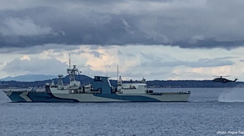
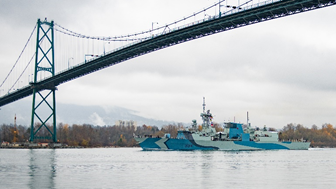
When one thinks of naval vessels today, the image is one of uniform grey: grey hulls, grey superstructures, grey missile launchers, and grey decks. What little variation comes from the red (or blue, for the Royal Canadian Navy – RCN) lower hull, separated from the grey with the black ‘boot topping’ stripe at the waterline. Shocking, then, might be the appearances of Halifax-class frigate HMCS Regina and Kingston-class patrol vessel HMCS Moncton this year to the viewer: their bright blue, black, and light grey patterns gracefully curving from stem to stern. Far from the feverish imaginings of some boatswain mate given too much leeway, the two paint schemes are callbacks to some of the most significant periods of the RCN. During the Second World War, Canadian and allied warships frequently sported a kaleidoscopic variety of paint colours and patterns in bids to confuse their enemies: against the featureless sky and sea, the enormous hulk of naval and merchant ships could not, it was thought, be hidden. The next best solution was, then, to hide what the observers were looking at. This note will summarize the historical development of naval camouflage, providing the background for understanding how the paint schemes currently worn by HMC Ships Regina and Moncton came to be.
Naval Colouration in the Steam Age
For much of the steam age, warships were painted in any colour other than what has become known in the vernacular as ‘battleship grey.’ A typical Royal Navy scheme during the Victorian period was a black hull, white or light grey superstructure, and ‘buff’ (think brown dress pants) funnels and masts. Being able to maintain this scheme in an age of coal dust and dark exhaust was a sign of the navy’s professionalism and general competency in peacetime: perhaps the sharpest example would be the American ‘Great White Fleet,’ whose white hulls and buff superstructures were kept resplendent as they circumnavigated the globe and debuted America’s rise as a major sea power. In wartime, however, the more stereotypical overall grey tended to be implemented, as with the belligerents in the Russo-Japanese War.
The grey could only do so much, however: with the plumes of dark smoke from period engineering plants, the fleets could be spotted well before they came above the horizon: an overall grey paint scheme provided little concealment advantage.

The Rise of ‘Dazzle’
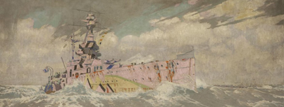
But if those massive vessels couldn’t be hidden, could they at least be obscured in terms of how they might be interpreted? Taking cues from nature, British artist Norman Wilkinson proposed a radical solution: instead of a futile attempt at hiding ships in a coat of uniform grey, it may be a better idea to try to deceive the viewer through patterns of brightly contrasting colours and shapes.

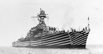
Thus resulted the set of First World War schemes known as ‘dazzle’ patterns. Noteworthy for their bright yellows, pinks, greens, and blues, the purpose of these schemes was to confuse German submarine commanders peering through their periscopes. In this period of submarines hindered by slow underwater speeds, accurate and precise estimates of a target’s distance, course, and speed was essential to correctly positioning the submarine for an intercept. A submarine commander misled as to those key variables might be forced to call off an attack as the submarine would be too slow to reposition. Under ideal conditions, some schemes could make a ship appear to be sailing towards the right of the viewer when in fact it was sailing away and to the left: while a surface ship with constant visual contact may be able to adjust course and follow, a submarine commander has no such luxury due to the need to limit periscope exposure. Thus, contrary to popular assumptions, dazzle patterns were meant to deter a torpedo attack in the steps leading up to launch (the cost being the submarine having to expose itself to catch up using its higher surface speed), not necessarily to cause a miscalculation of the torpedo launch itself.
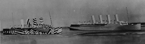
In the United Kingdom, France, and the United States (the latter under Everett Warner), schemes were devised by teams of ‘camoufleurs’ and tested in a studio using wooden ship models painted in various guises, with lighting and backgrounds capable of simulating a diverse range of real world conditions. The schemes that were the most promising were then applied to vessels plying the North Atlantic – predominantly merchant vessels, but also some warships. The concept, patterns, and colours were so striking they would influence that generation’s artists, leading to postwar art movements such as the Surrealists made famous by Salvador Dali.
Broadening Disruption
During the Second World War, a more reserved approach to the ‘dazzle’ concept made its reappearance. Gone were the bright pinks and yellows, replaced with more conservative hues of greens, blues, and greys of varying tonal intensities. Now termed ‘disruptive’ camouflage schemes, the patterns were created for use not just against submarines as in the First World War’s dazzle schemes, but broadened to include aerial, surface, and shore observers as well. Geometric patterns and colour instructions thus extended to the ships’ horizontal decks, not just the vertical sides. Towards war’s end, it was discovered that contrast (light/dark) mattered more than colour: the long distances at which ships were viewed would often result in a general ‘graying’ of the colours.
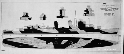
From the American Measure 31/32/33 series to the Royal Navy’s Admiralty Disruptive Patterns, ships adhered to drawings and textual instructions that called on crews to ensure everything that was shiny was painted over, while paradoxically applying paint schemes whose primary goal was to make the ship stand out to the observer. Early attempts at allowing ships’ captains a great deal of leeway in determining their own patterns, such as the American Measure 12 Modified instructions, failed to highlight that disruptive patterns only worked so long as the observer could distinguish the patterns themselves. In their haste and enthusiasm, early patterns devised pierside tended to have too many small patterns with delicate curves that all merged together at typical engagement distances, losing their disruptive effect. Thus, later centrally-prepared patterns were demonstrably larger in the sizes of the shapes used to ensure the disruptive effect could be maintained at relevant distances. For the early 21st century reader, think of pixels that comprise a digital image: zoom in too much and it becomes ‘pixelated’ and blocky, making it challenging to discern what the image actually depicts. Zoom back out to its intended ‘actual’ size, and the image becomes immediately clear. Accordingly, disruptive patterns needed to be large enough so they could confuse the viewer in the same way that a zoomed-in image appears ‘pixelated.’
The Camouflage Paradox
At the end of the day, however, two divergent requirements remained: concealment versus disruption, with each requiring the opposite ends of visibility. In order for disruptive schemes to be effective, they have to be clearly visible – the opposite of concealment objectives. Towards 1944, American experiments with horizontal black and white ‘zebra’ stripes was inadvertently found to potentially have the best of both worlds: at long range, the stripes merge together into uniform grey to serve a concealment function; at close range, the contrasting stripes become discernable, providing their disruptive function. By altering the width of those stripes, one could conceivably alter the range at which this concealment-to-disruption occurs, allowing ships to be painted in accordance to expected enemy capabilities and engagement ranges. However, by late 1944, the German naval and coastal threats were well on their way out whilst in the Pacific the new kamikaze threat focused camouflage measures on concealment from the aerial perspective. As a result, an emphasis returned to helping ships blend into the sea around them, resulting in many vessels being painted in an overall dark grey both on their vertical and horizontal surfaces.
Postwar, the maturation of radar and nonvisual means of detection and targeting reduced disruptive camouflage’s relevance. At the same time, modern fuel and engineering dramatically reduced the presence of dark smoke rising from the ship’s funnels – thus, a return to ‘traditional’ overall grey, providing a modicum of concealment effect in hazy oceanic conditions when viewed from the surface. With few exceptions, this has become the global norm, with ‘grey hulls’ serving as a synonym for naval ships. While some paint schemes worn today are reminiscent of the dazzle and disruptive schemes of the past, they are often implemented by coastal forces for concealment purposes against rocky shorelines, or for aesthetic purposes to help conceal engine exhaust stains.
Implementation of HMC Ships Regina and Moncton camouflage
The disruptive paint schemes worn today by HMC Ships Regina and Moncton are adapted from the patterns worn by destroyers such as HMC Ships Qu’Appelle, Chaudière, and Skeena in 1944 while supporting Operation NEPTUNE. The options analysis and sample drawings for the disruptive patterns’ application on current RCN ships were prepared in 2009 by Lieutenant(N) Jason Delaney, Naval Historian at the Directorate of History and Heritage, following a Maritime Forces Atlantic request for potential application during the RCN’s Centennial. Delaney offered several options, but recommended what he termed “Admiral Disruptive Scheme, D-Day” to highlight the RCN’s involvement in Operation NEPTUNE and to avoid repeating two other schemes currently worn by museum ships: the “graded” dark hull/light superstructure worn by HMCS Haida, and the white-and-blue “Western Approaches” scheme worn by HMCS Sackville. While the 2009 designs were never implemented for the Centennial, they were brought back in 2019 to commemorate the 75th Anniversary of the end of the Battle of the Atlantic (BoA). Ironically, then, although the schemes are being publicized as commemorating the BoA, the schemes themselves were initially chosen a decade ago to highlight the RCN’s role in Operation NEPTUNE/D-Day.
Quick references:
Tracy White. “US Naval Camouflage,” Researcher @ Large, http://www.researcheratlarge.com/Ships/S19-7/index.html. Summary of and links to digitized primary source documents on USN camouflage during the Second World War.
Roy R. Behrens. “Disruption versus Dazzle: Prevalent misunderstandings about World War I ship camouflage,” Camoupedia, http://www.bobolinkbooks.com/Camoupedia/DazzleCamouflage/dazzle.html
Timothy Choi is a doctoral candidate at the University of Calgary’s Centre for Military, Security and Strategic Studies. This work is the sole opinion of the author and does not necessarily represent the views of the Canadian Department of National Defence, the Canadian Armed Forces, the Royal Canadian Mounted Police or the Royal United Services Institute of Nova Scotia. The author may be contacted by email at: RUSINovaScotia@gmail.com.
A PDF of this Information Note is available here.